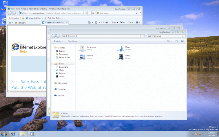
The first impression I got when I installed Windows 7 on my Mac (as a virtual machine, via VM-Ware Fusion):
Dudes, I did not expect you to be after KDE…

Am sorry, but that’s how I feel. I thought the folks behind Widows were always after OSX, but this time, 7 resembles more KDE than anything else.
Well, this is my first impression. And as with all first impressions, it is bound to change the more I walk around 7.

Just before I walk around:
I was not able to download 7 from my Mac. I clicked the Download Now button, and nothing happened. Same behavior in Firefox 3, Safari and Opera.
Then I used my friend’s XP – IE 7 to get it.
When you click Download Now, a pop up is opened with a download manager (Java!), apparently when the pop up is blocked, the app is able to detect it on IE 7 (and opens the download manager in the same window), and not on the Mac…
Once the pop up opened, I copy pasted(kind of, across machines, so I had to use email) the URL to my Mac.
If I cannot download it from my mac (directly), then how will Mac user switch back?
As I walk around:
The first thing I notice: When I open IE (that was the first thing I opened) from what used to be Quick Launch, I don’t see a window. The Quick Launch icon becomes a window itself… hmm… am convinced. No KDE, nothing. It is the Dock! The Mac OSX Doc!
Ok whatever. I am already used to getting impressed by stuff.. so much that I am not going to complain anymore. At least today.
But, is this useful or not? And usable or not?
Am not sure.
The only way I can differentiate between a open app and a not open app (for an app that has a icon in the Quick Launch) is by the rectangle around it. And, of course, this rectangle is not prominently visible.
I have no idea why those folks like washed out colours… looks like like a cheap cloth that has lost its dye.
Show Desktop:
How do I Show Desktop? This was my question for long. And then I forgot about it.
When I was looking for the Sidebar. And I thought I found it. There was en empty rectangle after the clock in the right extreme. Clicked on it, and all windows vanished.
So, Here is Show Desktop.
How the hell will someone know this? Com’on dude… you forgot(so soon) the reason why people hated Vista? I mean the real people… not those companies…
There were hell a lot of changes, things were not where they used to be…
Didn’t someone teach you to learn from your mistakes?
Nice One: Messages Grouped in the Notifications Area
This is a welcome feature. All Need your attention messages from Windows are grouped under a single icon. Will all apps behave similarly. Of course not. But at least they have something to learn from.
Window Borders:
My biggest complaint against XP was the prominent blue border.
Then came Vista, and I started loving XP’s borders.
7′ windows also have thick borders – but they look a lot nicer than Vista’s. Why… yeah.. they removed the rounds (of the rounded rectangle) at the bottom two corners…
Really Good: Tabs as Windows:
I have two tabs open in IE now: msn.com and Welcome to Windows (the default home tabs).
And they show as different windows when I click on the taskbar icon.
Actually a very nice feature. Tabs were meant to minimize window clutter, but also had the side effect that they got lost somewhere in the pile of open tabs. Now, at least, you can find them fast, at least faster.
Hey, and there is a li’l red x for each of the windows in the stack… good! So I can close windows (and IE tabs!) from here… nice one.
One more for today: There is no Save/Apply button in the personalize item of control panel. Hmmm… I decided I dont complain. When I say I don’t, I don’t.